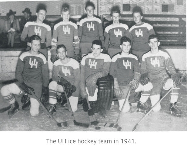
Like everyone else I’m partial to the logo when I was at UH.
Was the LH part of the UH Central Campus academic rebranding to separate it from the other schools in the system?
I would always say, “raw, raw, raw.” Sometimes I still do.
Not me, but I can’t decide between bevel and non bevel so I haven’t voted yet
Bevel logo fuzzed out on helmets from a distance
What difference does it make? As a former journalist it was always UH in articles and I think it still is.
Regardless it’s nothing to get riled up about.
Wonder whether we’ve ever used the single H on our helmets.
I don’t think so, because I know UHCL used it, too. Same timeframe, though.
I don’t know but if I were to guess I bet we introduced it in 1977 for the 50 year anniversary.
Its hard to date logos because as a couch warrior for the most part if they did not trademark it, you have to check yearbooks which get weird, or dated pictures on the internet. I keep a small archive and have that logo in photos dated 80, 82 and 90.
1962-1996
Would love just a single “H”.
And be Harvard?
“Oh look…Texas Tech is playing Harvard at TDECU.”
I like the older one because of the way the cougar is drawn. That depiction was the one used when I was growing up, which is probably why I like it.
I wonder how it would look if we only put the H from our current Houston script on the helmet. Might be too thin, but might work.
How about…?

.
.
.
![]()
I voted for the skinny UH but I like the current non-beveled one as well. That first one was still being used in 1970 when I started. It was what my parking permit stickers looked like. And I put a bigger decal version of it on the back on my Malibu. Nostalgia is a helluva drug! ![]()
Just think…we could have been THE hockey school of the south!
I still like paper season tickets. They are souvenirs.

