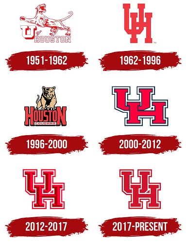
- 1951 - 1962
- 1962 - 1996
- 1996 - 2000
- 2000 - 2012
- 2012 - 2017
- 2017 - Present
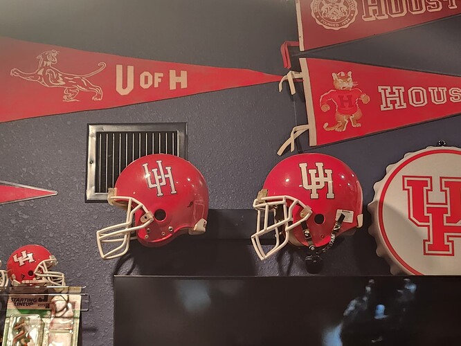
Versions of that 51-62 logo were used up until 1996. I am partial to the H. Everyone loves the skinny logo, but that is actually academic logo which is thicker than the logo we put on the helmets, I think the modify skinny we used for 3 years in the mid-90 is the best helmet logo.
It’d be interesting to know the age of who is voting where. I think the ‘62 logo that’s leading looks awful… but I became a fan in the 2012-17 era. Is it my own bias of when I became a fan?
As I understand it, we put the old academic logo on the helmets for a couple years in the late SWC/early CUSA days. I like the much thicker version (pictured here) better than the stick-thin version we actually wore, though. Additionally, The one listed here as 1996-2000 was actually a secondary logo used concurrently with Phat UH, as I recall.
Good to see the 2012-2017 logo coming in second, too. I was always kinda sad we got rid of the bevel. Better web design sleeps for no man, I guess.
Something tells me you have reasons for disliking that logo in particular. Wonder if it’s just too similar to another that leaves a bad taste in your mouth ![]()
If we’re sharing ages, I enrolled in 2012.
The bevel logo would be great but I cannot support a logo that does not have a blue trim.
That’s certainly possible. I think I just don’t like the elongated look. That actually would explain why I like the 2012 logo. It has a beveled edge and that other team doesn’t have a beveled edge.
Sailor Coog!
1962-1996. For me.
I grew-up with the 62-96 and hated when we changed. We need to go back to the old UH and quit hiring the company that makes them for Kentucky also.
Should only have one and stick with it if you want to start a tradition.
I’m glad we dropped the wet cat!
Yeah, I feel that age would probably play a part in this, too.
I became a fan in 2015, so I guess maybe that partly influences my vote. Also, I feel like the beveled effect makes it stand out more.
I think this should be on the list for the one day it existed…(April 1st)
I’m not gonna lie, that logo looks pretty cool. It’s unique
I honestly don’t understand the hatred for “U of H”
OU isn’t Oklahoma University, yet they rather OU than UO
U of H
The Phat UH was the Helton years, it didn’t start in 2000.
Maybe we should have changed back to the old UH after Dimel was shown the door.
I never saw this as an athletic logo but in the 1970s, UH went from the interlocking UH to the two letters horizontally connected. It looked something like this: |_|-|
It was on student parking decals and building signs all over campus.
I bring it up because I hated that logo.
That was basketball. Football always used the interlocking UH during that time.
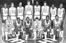
I actually like it…not as the official logo, but as a beautifully designed logo.
I could see it on a dri-fit sports t-shirt or pullover. It’d look nice.
Edit: Forgot where I saw this, but you can see that logo was used in older docs (this one is from 2002).
This is the essence of CoogFans in one sentence.
