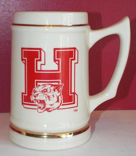
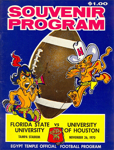
Yes, LH had a beautiful logo back then.
LOOK AT THAT TUITION COST!
Double what I paid. And I was out of state tuition. $40.00 a semester hour.
damn, right before the State deregulated tuition too…lucky lol…young people are being screwed
Meanwhile it’s about half of what I paid when I was at San Jac.
Starting in 2000 there is a small triangle on the top right of the H crossbar. That does not belong there. Whoever inserted that was apparently trying to get some 3D effect but that is a fail. Why it persists is beyond me.
Is the next poll
Eat em up Go Coogs Go
Vs
Eat em up Rah Rah Rah
It’s not a 3D effect; it’s because the outlines of the letters come very close to overlapping (and since 2012, they actually do overlap.) Try to create a “corrected” version and it’ll look even weirder.
Didn’t know it changed after 2017
I vote for Rah Rah Rah!
Talking’ bout the Mother Fn Cougars…
Yeah, this print out doesn’t do it justice imo
I have wrapping paper I found at a thrift store yrs ago that better displays this logo.
Will try posting on here if i can find the pic i took.
Why did they change it?
The bevel was awesome
NVM
I know they sound the same but I always meant “raw, raw, raw”. We ARE talking about eating, and the UH Cannibals, I mean UH Cougars, are so tough they would eat their opponents raw.
I agree.
I liked the beveled UH. That should never have been abandoned.
Personally, I’d have liked to see the beveled and de-beveled versions both used; as much as I like the beveled version, it has some really noticeable downsides. It doesn’t translate well to embroidery, and generally in a small format it gets messy. If I were writing brand guidelines, it would be something like:
Beveled Logo (Athletic Use Only):
- Midfield/midcourt logos
- Football/baseball/softball helmets
- 3-D applications (the signage on the IPF, etc.)
- In general, it should fill a box no smaller than about 1 square inch on physical media
Non-Beveled Logo:
- All academic uses
- All small-format uses (favicon, etc.)
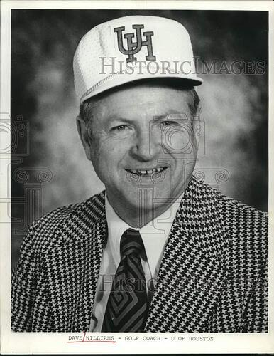
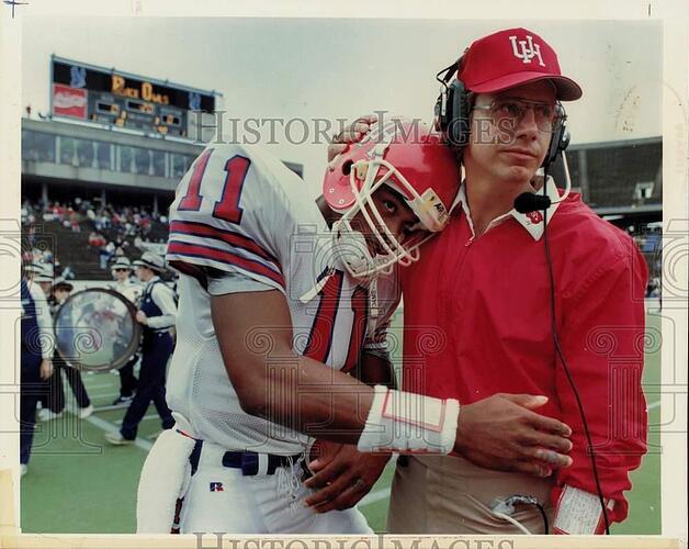
The issue with the skinny logo was it was almost exclusively used on the helmet they used several different UHs on hats and things.
The LH was primarily used between 1980 and the mid-nighties, but I know they used it some later, rarely used on memorabilia, mostly academic.
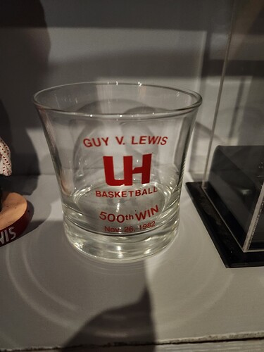
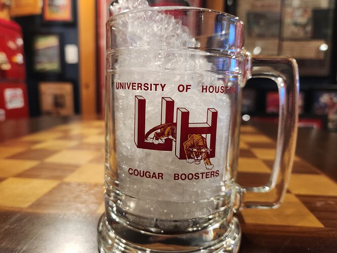
When we were using the skinny logo they also used this 3d logo for memorabilia and stuff. Its one on my favorites.
This the OG single H logo. Not my item, not sure when they actually used it.
If you want to debate the best Cougar that is a bigger hole to fall into.
Helton went from 2 years of the Skinny logo to all 4 years of the modified Skinny to the first year of the fat logo( with a stripe), he ruined several logos. I really did not realize we let him coach that long.
I was at the banquet when they announced his extension after taking us to the Liberty Bowl. It was a gamble that came back to bite us.
