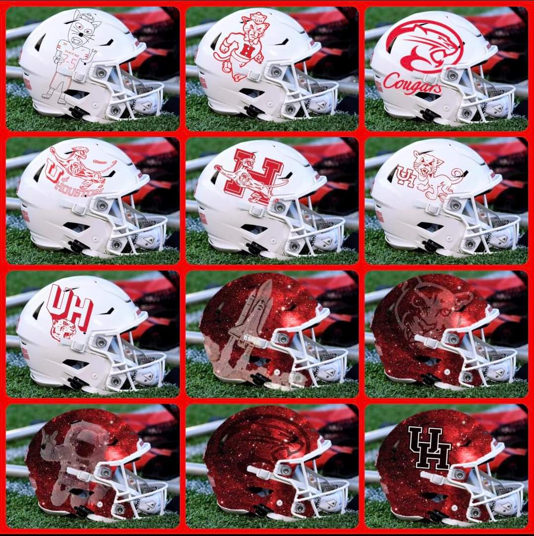
Has this been posted here yet? There’s been recent discussion about this here, and this image was on Facebook.
There are a couple of classic looks in here that I really like.
Has this been posted here yet? There’s been recent discussion about this here, and this image was on Facebook.
There are a couple of classic looks in here that I really like.
that top left corner is a must. Make that happen.
most look too busy for my taste.
give me a UH pencil logo or a Cougar on there and I’ll be content, im a simple man.
I think those are all terrible for helmets, although I do like a few of them for t-shirts or whatever.
Those are all an abomination. If it was not worn by one of Bill Yeoman’s teams I don’t want it. Also none of those have any blue accent trim and I require blue trim.
I like the Astronaut with the Coog hand sign as a one off.
Zoom in on that hand sign and may not like as much
Would have to win out to earn top left
Good catch.
My fault for assuming that was a Coog paw.
All of these are a no for me, but it might just be because the photoshop was bad.
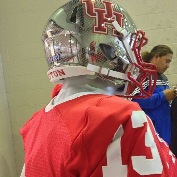
I know it’s out of fashion now, but I really think that chrome helmet we seem to have considered during the Levine era had potential.
![]()
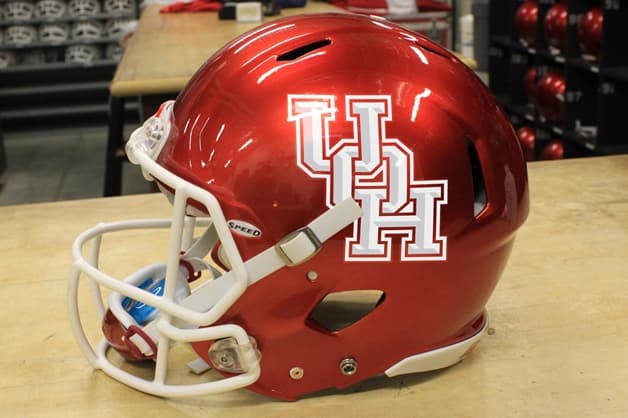
The best, hands down ![]()
![]()
![]()
I just threw up a little…
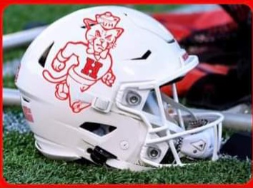
Yes to the walking cougar with the H sweater.
The rest…meh
While I like that design, isn’t it just a WSU rebrand?
Winner of that group.
1,2,4,5,and 7 are all acceptable.
I agree…I think you have to win a bunch to unlock number 1.
Make 1 or 2 the positional accurate helmets…I’m in.
where’s my gotdang palm tree!?!?!?!?

Haven’t we stolen enough from WSU?
Lol once they get relegated to G5 no one will notice
©Copyright 2017 Coogfans.com