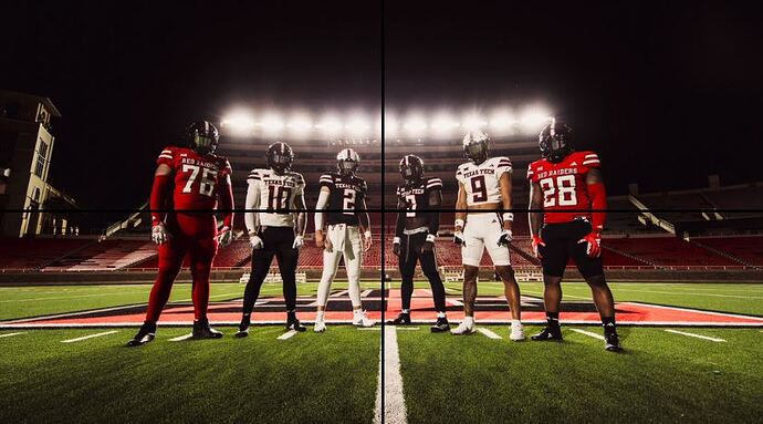
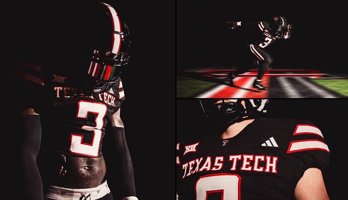
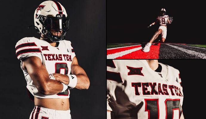
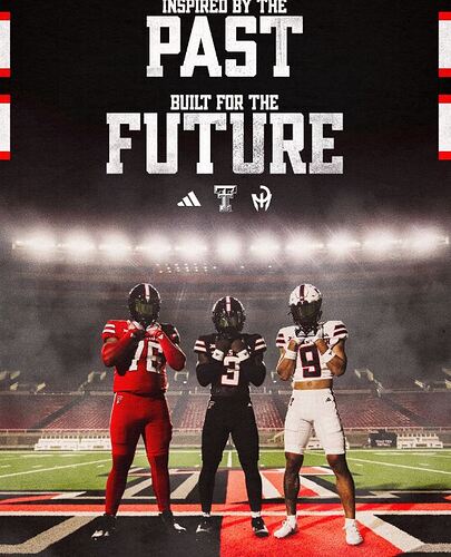
I hate to say it but its a big yay for me. It reminds me of their 1980s style uniforms and some of the SWC uniforms. Stripes are a little generic but they also rocked stipes for decades…
Just need to beat their ass in 2025.
Better for sure
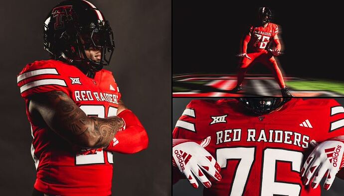
6 different uni’s…Tech looks like they got it covered…The red and black and all red with black helmet look particularly good.

Yay! If you’re not a championship team, you at least want to look the part.
They’re good, if a little bland. It’s gonna be weird seeing an Adidas logo on their jerseys, though – they’ve always been a defining Under Armour team for me. But the fit and material are both really good, and the letter and number fonts are very distinctively Texas Tech, which I think is a lesson we can learn from in a conference where almost half of us wear some variation of the same palette. If you cover that up and look at these, they could just as easily be a uniform release for Cincy or ULL or Louisville, but that one branding touch takes these from indistinguishable to distinct.
Also, their all-red look in particular is atrocious and I hope it never sees the light of day.
They look good
Bland. Recycled some elements of Kansas’s Adidas uniforms unfortunately. Very serviceable though.
Also, to some extent, it’s just hard to go wrong with red/black/white, which is why so many teams do it. You have to work really hard to put together a uniform with those colors that’s anything worse than “a little bland.”
What is this? Mr. Blackwell hour for Texas Tech?
yeah they are pretty cool. Modern but clean… I’ll give them 8/10
Very nice.
Where the hell is our uniform reveal? I’ve seen Tech, TCU and Baylor.
We seem to only update every other year, and we updated last year.
At least they’re not under armor anymore.
Dang those are CLEAN
Red pants should be banned.
The red pants would be fine if they didn’t also have red socks. It’s the full ketchup bottle look that’s a problem.
Fire.
It’s a ‘meh’ from me, but im so effing envious that Tech releases this on social media & it seems they get more traction than us (except for the Luv Ya Coogs blue kit).
Just saw Tech’s AD, Robert Giovanetti, on SicEm 365 saying they’re gonna unveil new kits for their Women’s Soccer & Volleyball…
When’s the last time our soccer team got new, actually appealing kits? They look bland af
