This came through LinkedIn…
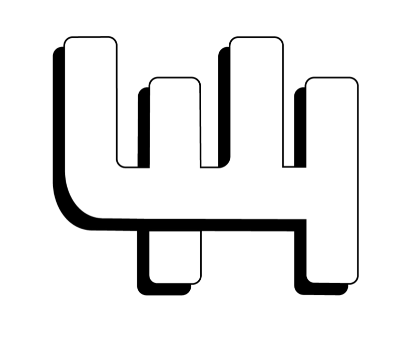
I was never a big fan of the logo from 1996-2000. It had the shortest run.
This came through LinkedIn…
I was never a big fan of the logo from 1996-2000. It had the shortest run.
If you don’t have LinkedIn
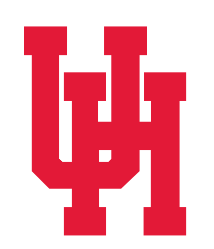
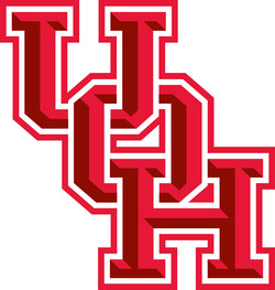
Iconic, easily recognizable, and interlocking U and H traces back to university’s beginning.
Its clean and timeless.
Sorry, skinny logo is unlike any of the other inter-locking schools.
IMO it embodies U of H and Houston.
I like both the 1962-1996 and 2017 - Now. I wish we could destroy any evidence of 1996-2000. Seems like the wet Coog was missed. It belongs with the 1996-2000.
Wish the cougar of the 1951-1962 was still used above and beyond one or two t-shirts. It’s awesome.
Never had seen the 1930’s one. Wild stuff.
I think you can build that old logo with Legos or Lincoln Logs.
Yeah, it’s a pretty awesome logo. I like the current one but wouldn’t mind going back to it.
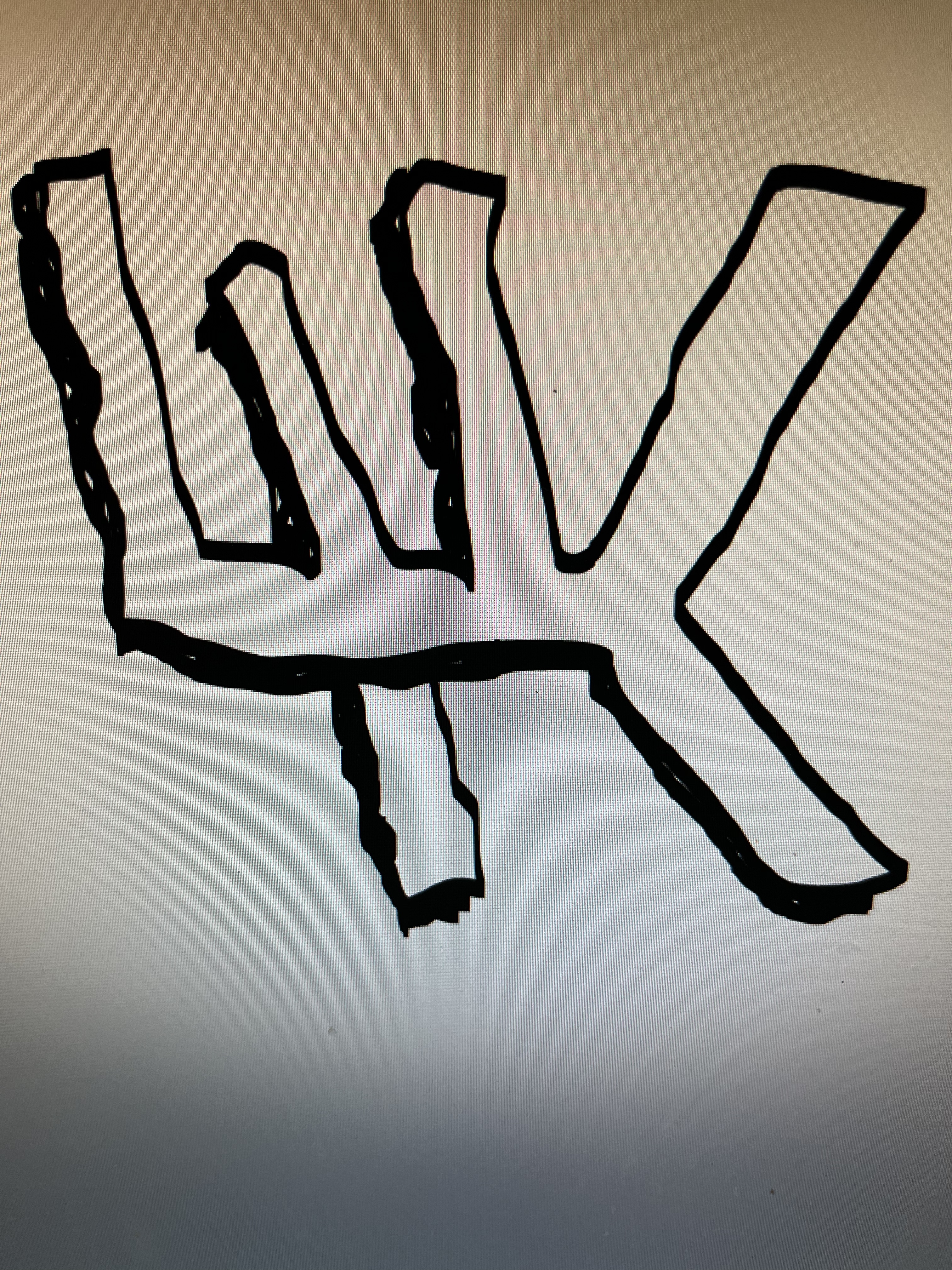
My kid says it looks like what she used to draw in elementary school when trying to draw the uh logo
The logo, or the teams as well?!?
I like the beveled logo there.
never should have moved on from this one…
A Levine classic! He was good at the April Fool’s jokes.
To me, that looks more like a catus that an Arizona or New Mexico school could use.
©Copyright 2017 Coogfans.com