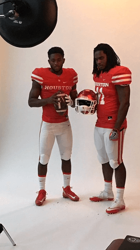
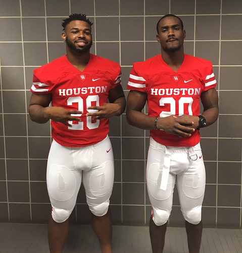
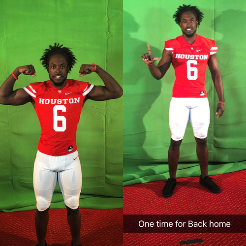
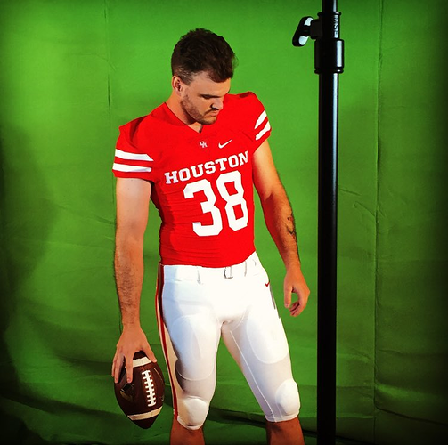
I’d say the unis definitely have a BiG look. With a white shirt and helmet combined with red pants, it’s Nebraska’s roadie unis. All white is Whiskey’s.
Classic and old school. I dig them.
I really like these. Very classy. Yes, they look a lot like Nebraska but we could do worse than look like a five time national champ school. And we HAVE done a lot worse previously.
They will look really really nice with a Championship Game patch on them come January.
+1
I love the classic look. Stripes, solid colors and you know The Coogs will mix it up with red hats, all red, all white, etc.
Because polyester doesn’t come in metallic red, and if it did, it would look ridiculous.
Another example of a helmet and another part of a uniform being two, totally different colors, and it seems to work for them.
<img src="/uploads/db5902/original/2X/4/49a768e04d174192a3d8af59c8ee3f5b9114ab70.png" width=“640” height="35
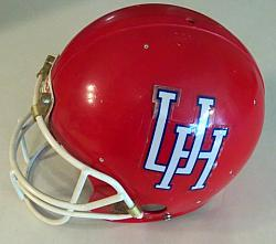
I like 'em, but the helmets (the decal is what gets me, not so much the color) and jerseys do sort of clash. Would love to see those jerseys with these helmets:
Meh. Move along. Nothing to see here.
The uniforms on players…
Taking the #HTownTakeover to ESPN the Magazine with @G_Ward1 & @ThaKid41 pic.twitter.com/Tz6nkeQoxC
— #HTownTakeover (@UHCougarFB) July 26, 2016
https://twitter.com/TheDennisLe/status/758005594741575681
https://twitter.com/travelerwanders/status/758006512497205248
When I first saw them for the OU game I thought they were throw backs to kind of showcase for the Big XII how it might look. Then when they came out against Lamar with the same except white pants I initially was disappointed to realize these were the new unis. I REALLY liked the previous uniforms. I thought they were extremely sharp and modern without being audacious like Oregon, OSU or Bowling Green for example. I hope this doesn’t mean they through out the Halloween unis too! Those rock!
Uniforms are moving in the wrong direction. UH should be on the edge. Whoever is in charge of our uniforms, it is the wrong person. Old men shouldn’t be in charge of uniforms, and that is clearly what is going on with us. Our uniforms look pretty much exactly like BYU last night, and theirs look like crap too.
C’mon now, let’s be real here. UH cannot and will not be cutting edge on its football uniforms. Only a program like Oregon with nearly unlimited $$$ can be cutting edge.
Y’all realize that Nike has only a few base templates for uniforms, right? All the weird shaped panels on the shoulders, stripe options, etc., they’re all in one of like five sets available for team purchase. Oregon gets something special, for sure, and a few other teams, too, but most teams just have to pick something and apply their color scheme to it however they want, then buy that. Our uniforms this year look like a lot of teams. Last year when Oklahoma had the weird contrast color sleeves with the angled thing on the front of the shoulders - the exact jerseys that Washington was (and still is) wearing, just with different colored cloth.
I like our new uniforms - they are simple, classic and look to be the same Nike Mach Speed versions that all the other top Nike teams (OU, Ohio State, Alabama, Texas) are wearing. More importantly, our players all seem to like the new uniforms based on all the twitter pictures they’ve posted. Besides, did you see what Oregon was wearing in their game yesterday? That looked way too busy and borderline tacky. Goes to show that money doesn’t’ necessarily buy you good taste.
Hopefully, we’ll have alternate uniforms (i.e. blackout) for either the Halloween or Homecoming games.
Look good, and COOGS winning will make any uniform look good.
