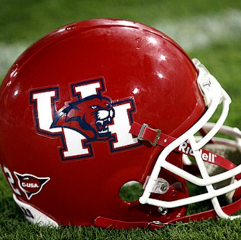
The fat UH is garbage. Always has been, always will be. If the old logo was still in use, it would see the same sales as the new. The logo doesn’t drive the sale. The “university” logo is far better than the fat UH used for athletics.
I’m not sure what the politics were beyond the athletics dept wanting a logo and branding they could control, but I’m glad the university retained a brand with the more classic look to it.
I personally like the new logo. I think because of the new logo I’m more likely to wear it since it looks more modern. There are some throwback t shirts with the old logo i would like but on polos i don’t think I’d like it as much.
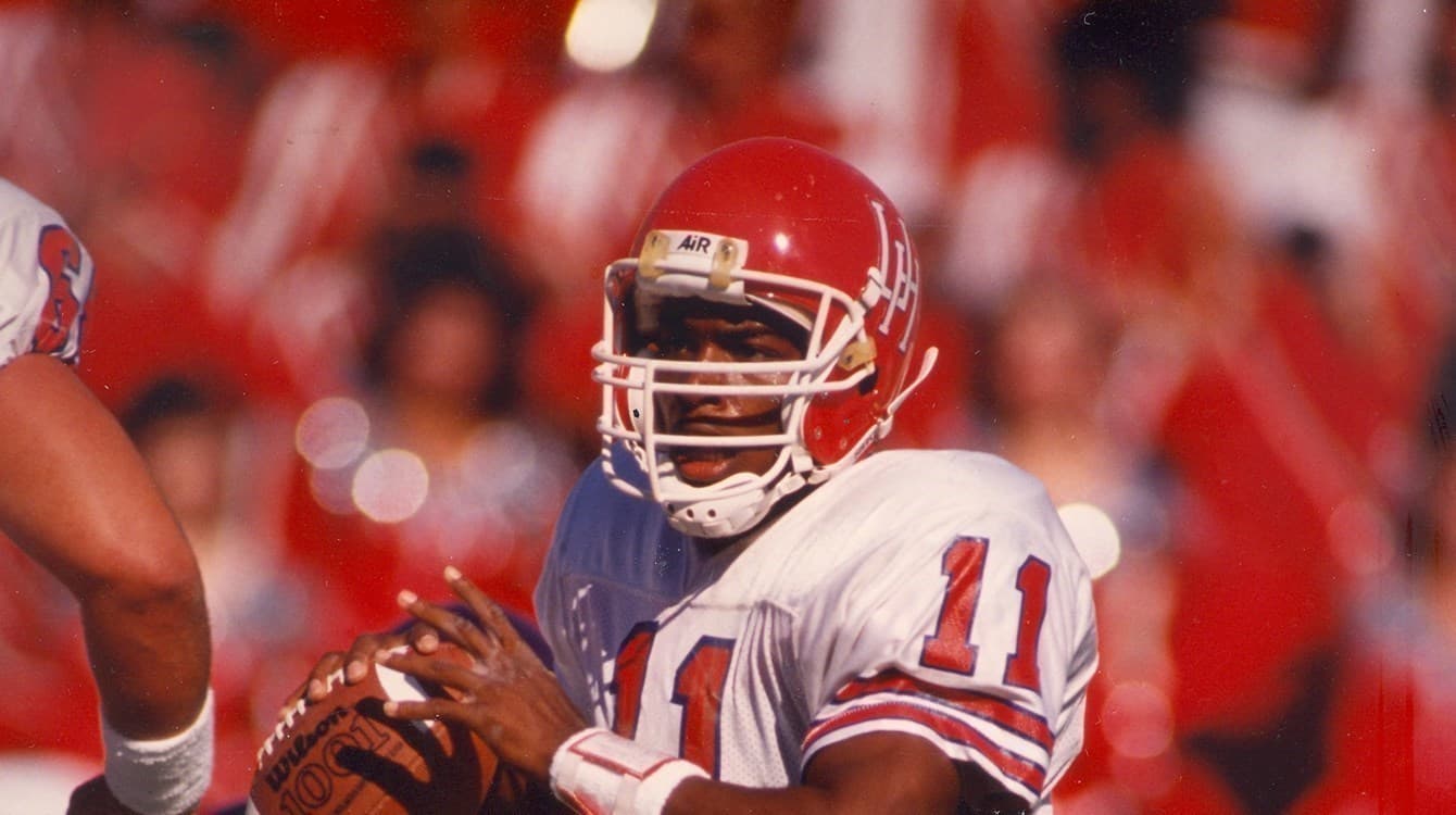
It had it’s time and place - I still have several items with it on them. But, for me, it reminds me of the C-USA days. While there were some highlights to those days, I prefer to leave those days and that logo in the past.
I prefer the old school logo (the one the university still uses). Personally, I like uniqueness, something that says ‘this is ours.’ The current logo is just like Kentucky’s, whereas the old school logo stands alone.
You’re correct, but that’s what tends to happen when you get away from what sets you apart. I’d just rather UH have a logo recognizable as it’s historical standard. Much like, dare I say, UT, TAMU, TT, etc.
Out interlocking logo has stayed mostly the same over time other than adjusting width and bevels. That’s not that different than what other schools have done (Tech, OU, aggie, etc.).
Current logo set is my favorite that we’ve had since I’ve been there. I went from 06-10 so I do like the fat logo, but never really liked wet coog logo.
I don’t think it’s the best logo we’ve ever had, but it does beat its immediate predecessor. Personally, I felt like the (post-update) beveled version felt more “UH”, but I dont really have any complaints.
Mmm yeeeaahh, true. But, the devil is in the details…ie. the way the letters interlock, the font, the length, etc. MANY schools have made slight tweeks to their designs throughout the years, however most logos still remain pretty distinguishable from everyone else’s (TT, TAMU, UT, Michigan, UCLA, USC, and so on). College is all about tradition…you either have one, or you’re trying to create one. This is derived from consistency in identity. Personally, I just prefer the identity of the old school design which was uniquely UH’s.